BRIEF
Gravitti is a brand offering a diverse range of home goods — from kitchen appliances and cleaning tools to seasonal and wellness products. With plans to expand its product line, the company needed a refreshed brand identity and a packaging system that could adapt across multiple product categories.
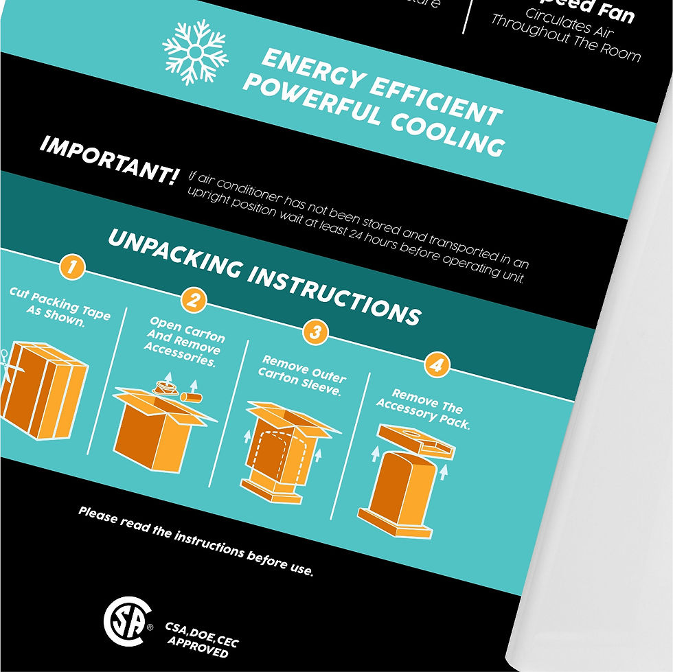
The challenge was to strike a balance between brand recognition and category distinction. The client requested that each category (Kitchen, Seasonal, Health, and Home) feel visually independent, allowing flexibility in colour and tone to appeal to each market segment.
SOLUTION
The rebrand began with a refined logo that modernized Gravitti’s original mark while preserving its familiarity. The upward-pointing triangle subtly references the company’s legacy logo and symbolizes forward movement and quality, key attributes that define the brand.
Each packaging design was developed to reflect the tone of its category, using distinct color palettes and imagery to resonate with different audiences. While the visual expression varied between product lines, consistency was maintained through layout, typography, and information hierarchy, ensuring that every box still felt like part of the same family.
This project highlights an ability to balance creative flexibility with structural discipline, delivering a packaging system that met the client’s request for individuality across categories while maintaining a unified, professional brand presence.