


Brief
Since 1983, Swissmar has been known for quality European housewares but the brand needed a modern refresh to align with its global ambitions.
Solution
The redesign centered on a "heritage-forward" evolution. Despite the brand’s strong reputation in the market, the logo felt dated and the visual language lacked cohesion. My objective was to evolve Swissmar’s identity, giving it a modern look while preserving the heritage and recognition that customers trusted.


BRAND IDENTITY
BRIEF
The original logo featuring a maple leaf and the Swiss cross served as a starting point for the rebrand. A promising first concept was developed but legal regulations required us to pivot and develop an alternative without the Swiss cross or maple leaf.
SOLUTION
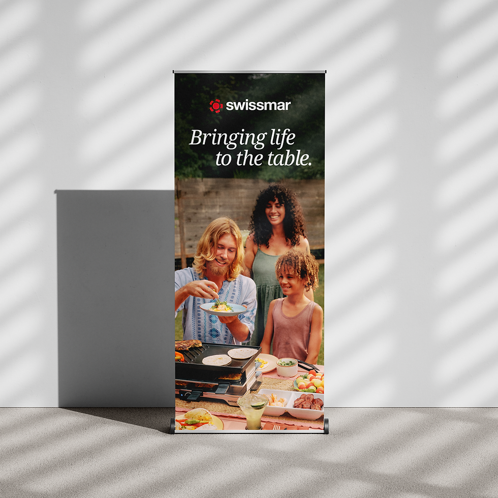
The new direction for Swissmar as a brand focused on celebrating shared experiences rather than products. The icon is inspired by an overhead view of a dining table surrounded by chairs, representing the place where we gather with friends and family.
services
Logo design
Brand strategy
Brand guidelines


wordmark
To honor the brand's heritage, I set the wordmark in Helvetica, a well established Swiss typeface. Its mathematical precision and neutral character provided the ideal foundation to support the bold, clean lines of the new icon. I engineered the outer stroke weight of the icon to precisely match the stem thickness of the letterforms. By creating this direct geometric link between the symbol and the type, I ensured the identity felt cohesive and balanced.
tagline
I developed a custom typographic lockup for the tagline, ‘Bringing life to the table’ by splitting the copy across two lines. By precisely aligning the ascenders and descenders I engineered the lockup to nest together perfectly.


PACKAGING
BRIEF
Packaging was a major focus of the rebrand, with significant attention given to how the new identity would appear at retail. We retained Swissmar’s signature red and white logo to maintain brand recognition, while introducing an warmer colour system to create a more premium and timeless look.
The layout and typography were chosen to convey quality and craftsmanship, while the new colour pallet allowed the food photography to take centre stage and provide a neutral backdrop that performed well at the retail level. The goal was simple: make people hungry while positioning Swissmar as a high-quality, industry-leading brand.
services
Package design
Studio photography
Lifestyle photography
Icon design


MARKETING
BRIEF
Rolling out the new identity across all supporting materials was where the brand truly came to life. I designed a new product catalogue featuring updated color, typography, with new studio and lifestyle photography.
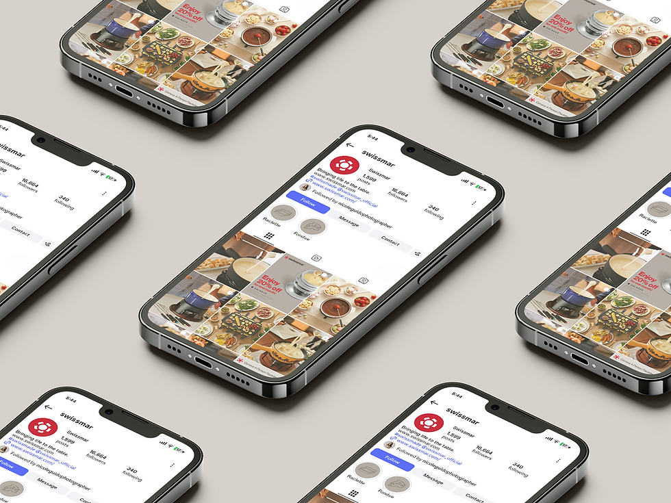
Together with the team, I developed a suite of marketing materials including posters, banners, and social media templates, all aligned to the new visual language. I also created a logo animation to communicate the meaning behind the new mark and provided creative direction for the updated website, ensuring a cohesive brand experience across every touchpoint.
SERVICES
Collateral kit
Social media kit
Marketing assets
Logo animation
Video Editing


CATALOGUE
BRIEF
This catalogue serves as the primary connection between Swissmar and their retail partners. Designed for maximum clarity and brand impact each flagship product was given a showcase section while lesser products followed a more traditional layout. Rooted in Swiss design principles, the layout utilizes a strict grid system and bold typography to establish a clear visual hierarchy.
services
Catalogue design


PHOTOGRAPHY
CAPTURING THE LOOK
I directed and captured a series of lifestyle images designed to anchor the brand in the warmth of human connection. Following a strict visual framework, I looked for locations that favored minimalism, utilizing clean marble surfaces and natural wood textures to ground the products in a place that felt like home. By utilizing natural, diffused sunlight between 10:00 AM and 2:00 PM I was able to achieve an inviting, authentic glow without the sterile feel of studio flash.
Consistency is essential for making sure studio product photos all feel like they belong to the same brand. I used a combination of lighting techniques and camera angles to ensure that every product, at every size, felt like it belonged to the same family.
SERVICES
Lifestyle photography
Studio photography


LET'S TALK
Start laying the foundation. Tell me about your vision and we can start building something remarkable together.